Cigna IFP
Landing Page
Background
The Individuals and Families Program (IFP) is the largest segment of Cigna, and the primary way for the general public to get insurance without going through their employer. The IFP main landing page is the second most visited landing page on cigna.com after the home page.
Roles and Responsibilities
- Property Owner
- Project Manager
- Back-end Developer
- Me (UX/UI Designer, Frontend Developer)
The Challenge
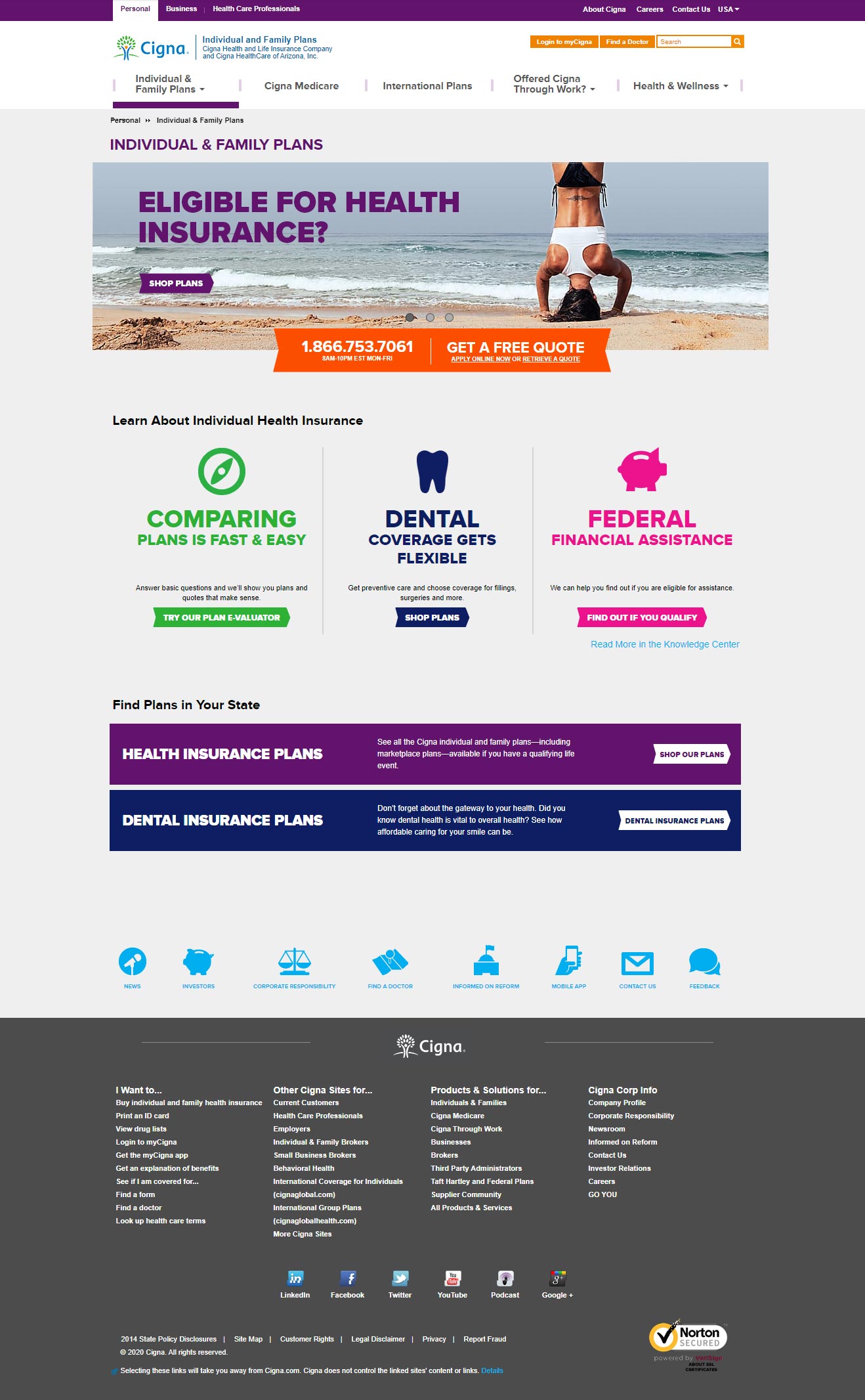
The IFP landing page was designed with a top carousel banner that rotated with the slides in order of importance; Health Insurance, Dental Insurance, Understanding Insurance - Information Guide. Each slide contained a call to action that directed the visitor to the corresponding landing page. The problem was that the Dental and Understanding Insurance slides didn’t receive many clicks because they were under the Health Insurance banner for several seconds before the slides rotated.
The challenge was to come up with a new design that provides a more equal amount of traffic across the properties.
Before - Old IFP Landing Page Screenshot
Hurdles
The Cigna website lives on a CMS platform called Teamsite. The site is designed and developed utilizing a design system of interchangeable pre-designed components that serve to maintain consistency throughout the site. While this can serve as a valuable method to preserve design integrity, it can also limit options. In this case, there were no existing components that solved the proposed challenge.
Opportunities
This project came during a time when cigna.com was going under a new redesign phase. This made it easier to propose any new design ideas and concepts to the team, and if they are accepted, to add them to the new component library for future designs.
Target Audience
The Individuals and Families section of cigna.com is aimed at the general public who prefer to get health or dental insurance on their own rather than through their employer.
Solutions
Since there were no existing components that solved the challenge, a custom design was needed. The first thing to do was to bring the Dental Insurance call to action to the surface, placing it at the same level as the Health Insurgence CTA so that it's not hidden right when the user visits the page.
Since “Understanding Insurance” was simply a general information section of the website, the decision was made to move the CTA down a level to each Dental and Health landing page rather than keep it on the IFP landing page. Doing this also kept the focus on the two more important items in the information hierarchy.
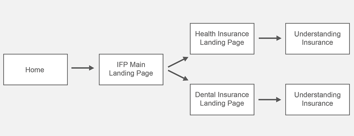
New User Flow
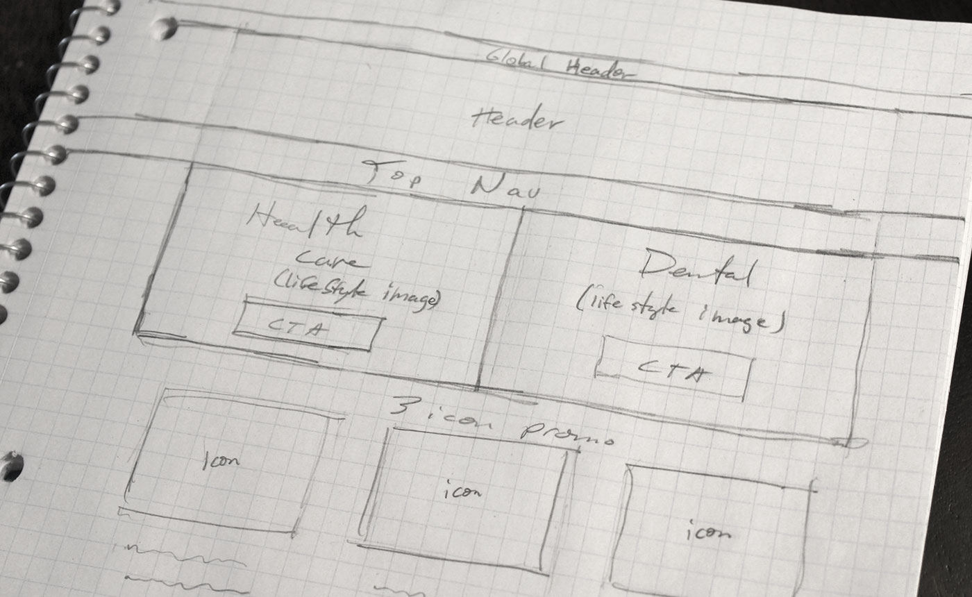
New IFP Main Landing Page Sketch
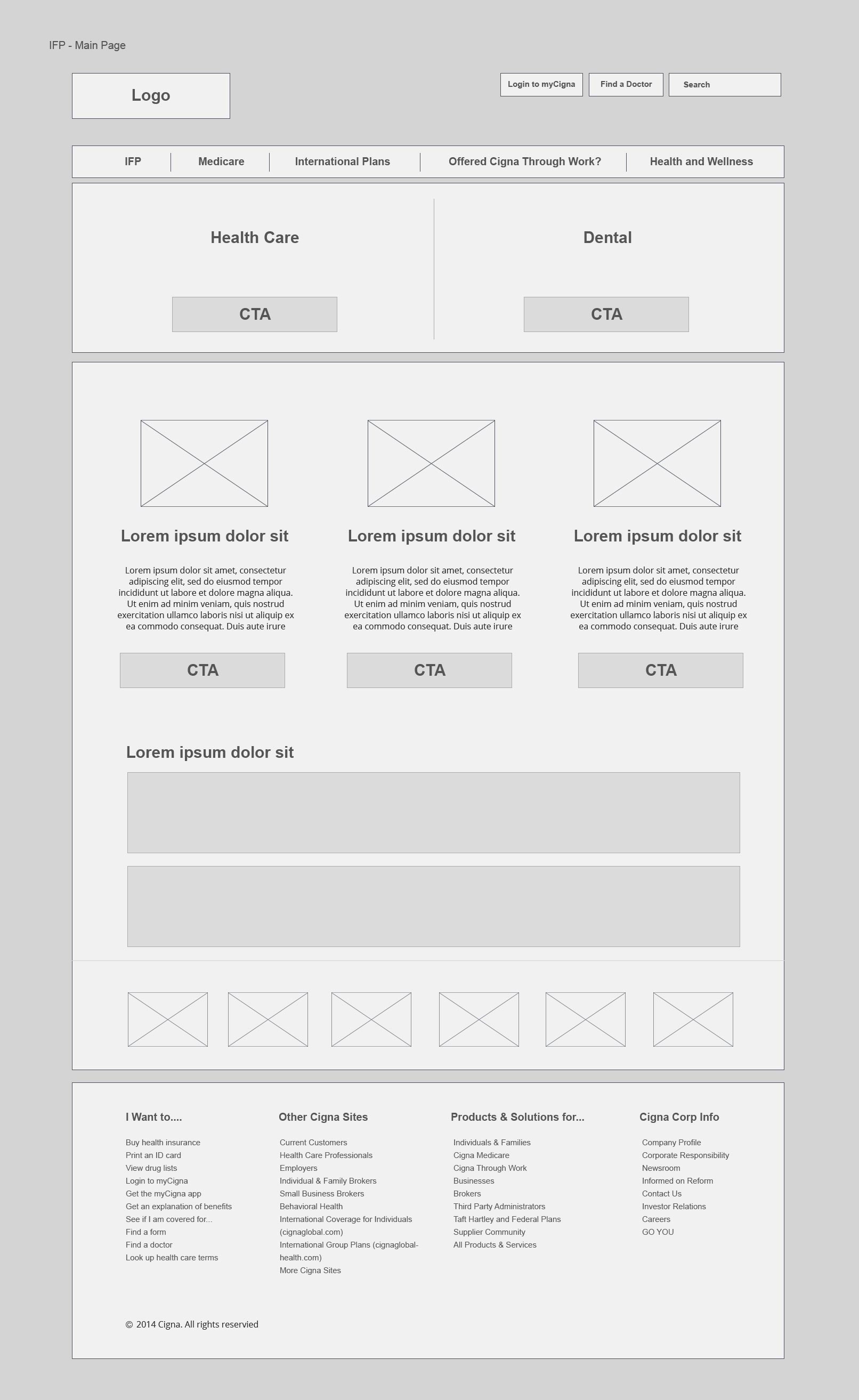
New IFP Main Landing Page Wireframe
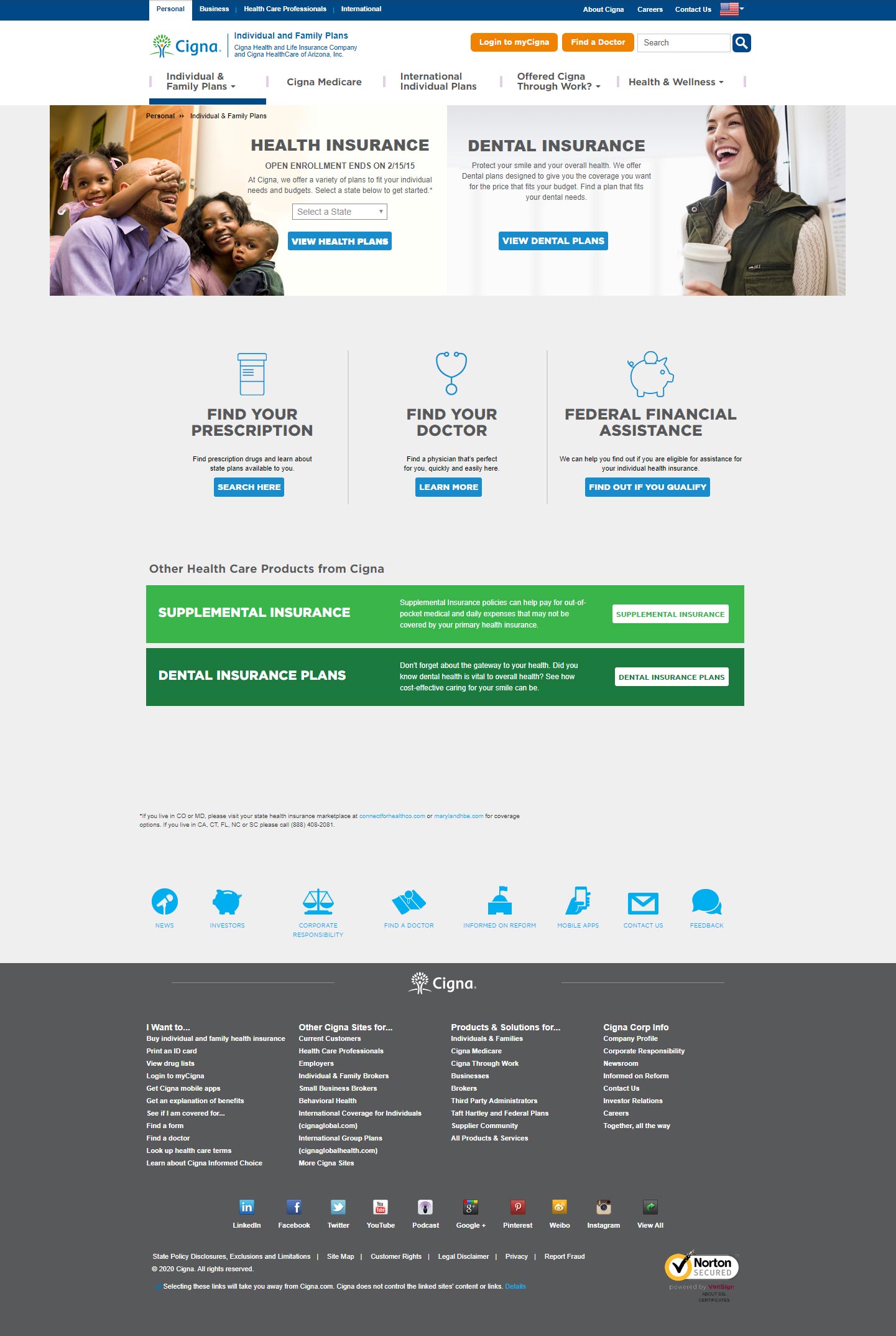
After - New IFP Landing Page - High Res Mockup
For the final high-resolution mockup, each side of the new top hero contained a lifestyle image keeping in sync with the Cigna Digital Brand Standards. Also, bookending the hero with each image on each far side directed the visitor’s eye towards the center, which contained the two CTA’s side-by-side, making the choices even more apparent.
Final Thoughts
By minimizing the CTA choices on the main IFP page from three to two and making them both on the same static layer (rather than rotating), traffic increased not only for Dental Insurance but also for Health Insurance. As a result, this new top hero design remained on this page for four years until being replaced when the entire site was revised.