Cigna - Choose a Directory
Background
The Cigna "Choose a Directory" page on cigna.com was where visitors could locate a doctor, dentist, or medical facility by browsing and searching all of Cigna's resources as well as other services, too. It was one of the most visited pages and a prominent feature of the website.
Roles and Responsibilities
- Property Owner
- Project Manager
- Content Writer
- Me (UX/UI Designer, Frontend Developer)
The Challenge
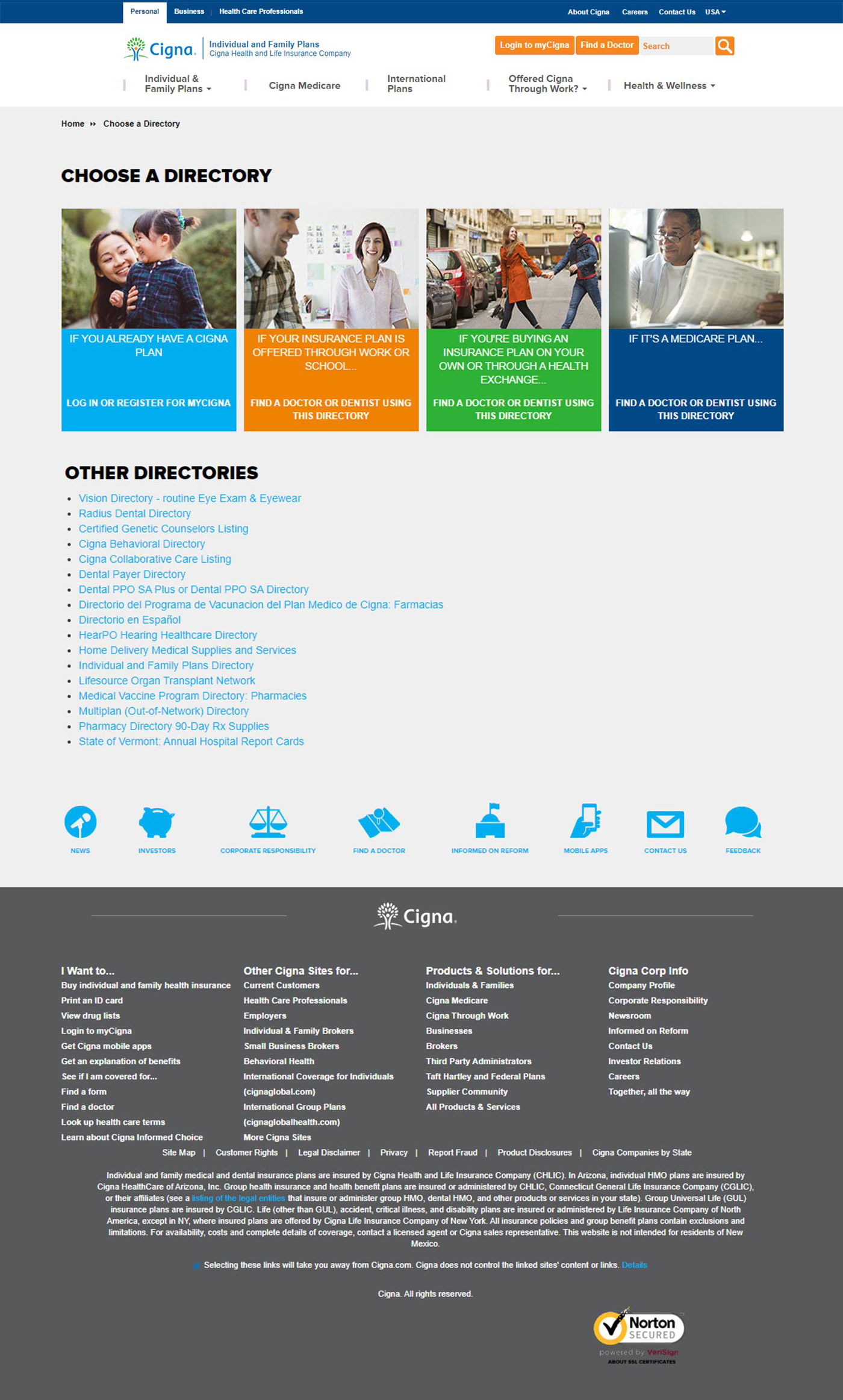
The landing page had been live for several years and was overdue for an update. User testing and analytics showed that visitors were missing many of the key areas and links, so the user flow needed to be reconsidered. Also, style updates were needed to the latest Cigna digital standards as well.
Before - Old Choose a Directory Page Screenshot
Hurdles
Just like the IFP main landing page, no existing components were available to solve the main issues of the page. Therefore, the page needed to be custom designed and developed.
Opportunities
The existing page was already a custom design, so it was just a matter of updating the existing layout and code. The page had been a major pain point for a lot of visitors, so new ideas for improvements were greatly welcomed by the property owner.
Target Audience
The "Choose a Directory" page was established to help all visitors to cigna.com.
Solutions
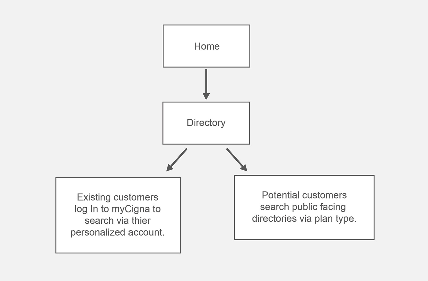
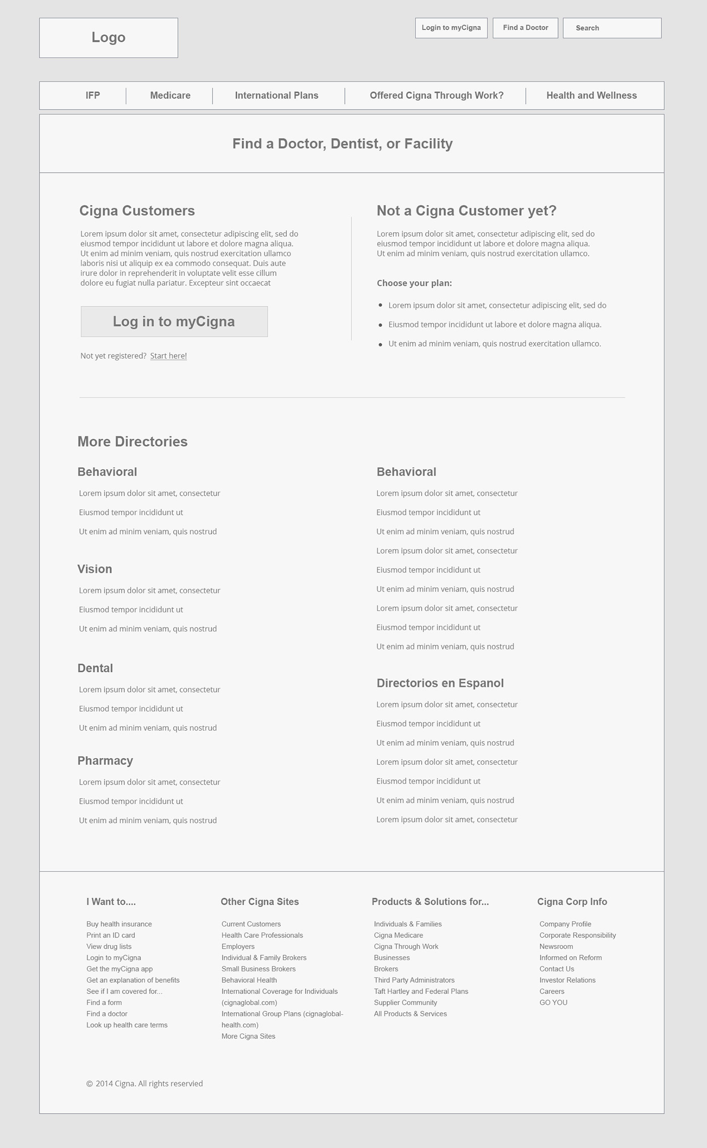
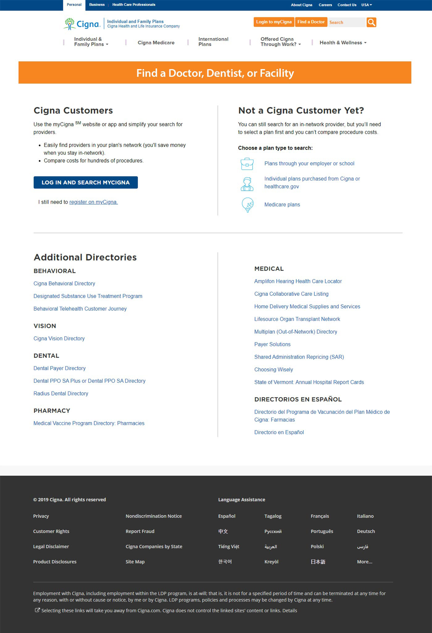
User testing reflected that the top issue with the page was confusion with visitors deciding which directory they needed. One of the top business requirements was to find a way to get existing customers to take advantage of the search functionality inside their personalized myCigna accounts. Therefore, to simplify things, I decided to split visitors into two groups, existing customers and potential customers. Existing customers were directed to log in to their myCigna account where they can find personalized directories specific to their account settings, while potential customers were guided to search general public-facing directories through the plan type they needed.
Another prominent issue with the page was the use of imagery. User testing revealed that a lot of the imagery was misleading and confused most visitors. Since the directory was supposed to be completely ambiguous and available to all users it was decided to remove imagery completely so as not to add confusion to the user experience.
New User Flow
Other user feedback mentioned confusion around exactly what the directories were for. So to resolve this issue, we decided to replace the general verbiage of the page title "Choose a Directory" with the more specific verbiage "Find a Doctor, Dentist, or Facility".
New Wireframe (with new title)
After - New Choose a Directory Page Mockup
Final Thoughts
After the page had gone live for several weeks, analytics showed that the UX goals started being met. Existing customers were taking advantage of their user accounts, and new visitors were finding the directory they needed faster and easier than before. The page quickly grew in traffic and the property owners were extremely pleased with the results.